Web
Focus
Web
Branding
UX
Medium
Digital
Case Studies
These web case studies explore selected digital projects in detail, outlining the strategy, design decisions, and technical considerations behind each site. Each project demonstrates an approach rooted in clarity, usability, and purposeful visual design.
Client:
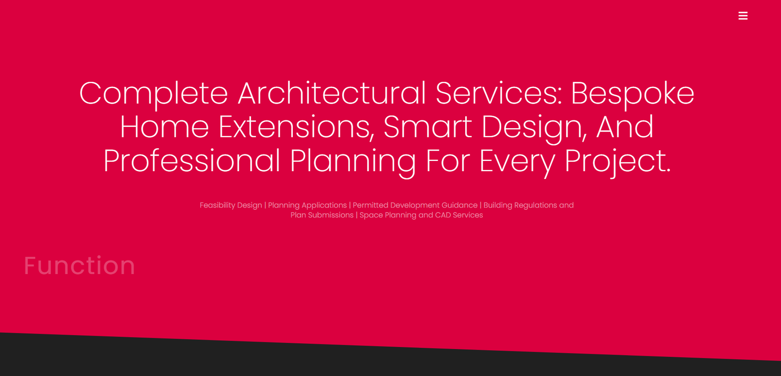
Maydean Design – Architectural Services
Service:
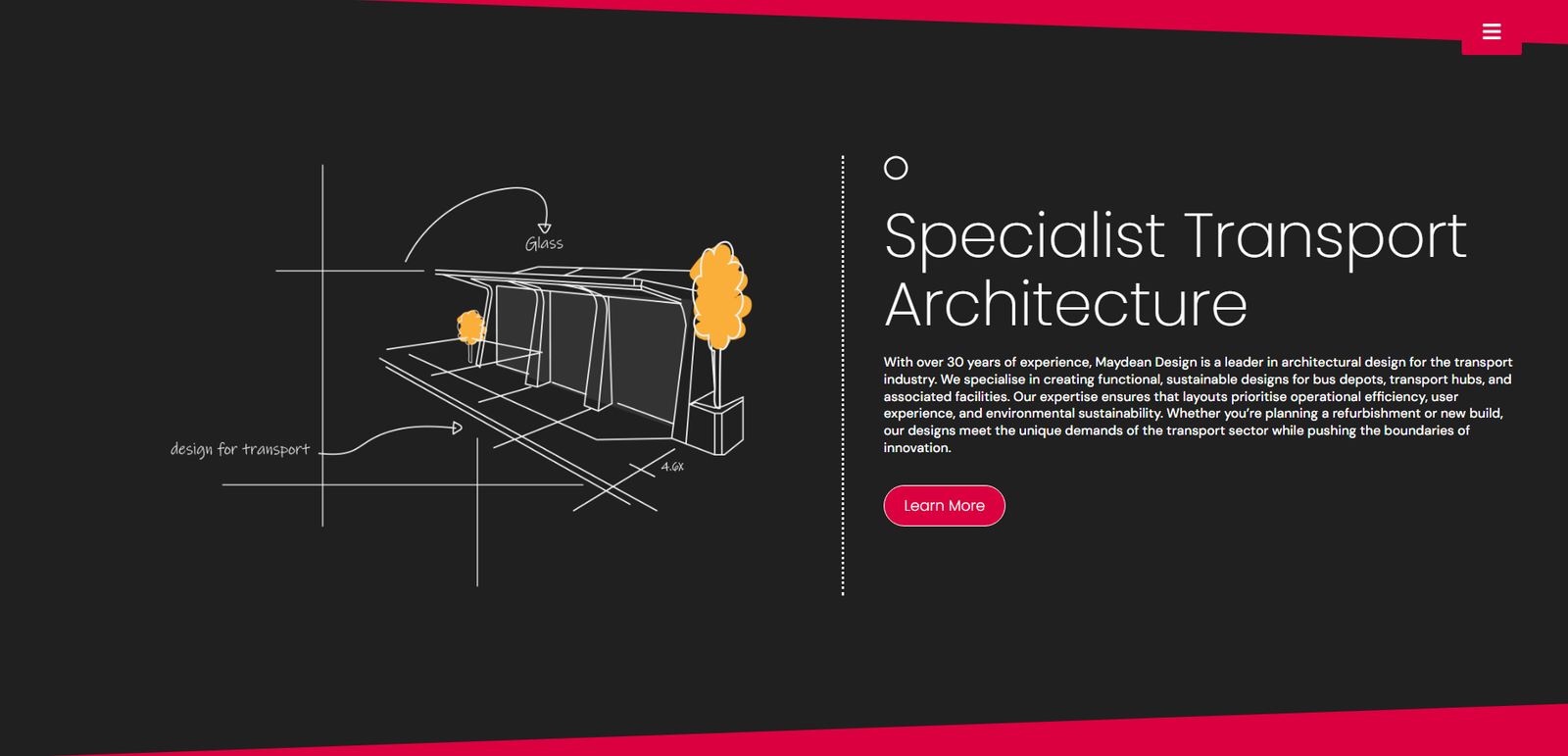
Maydean Design provides bespoke architectural solutions for residential, commercial, and urban spaces. From concept to completion, we craft designs that balance innovation, sustainability, and functionality, tailored to each client’s vision.
Brief:
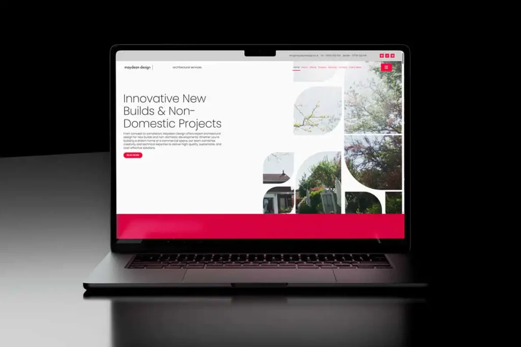
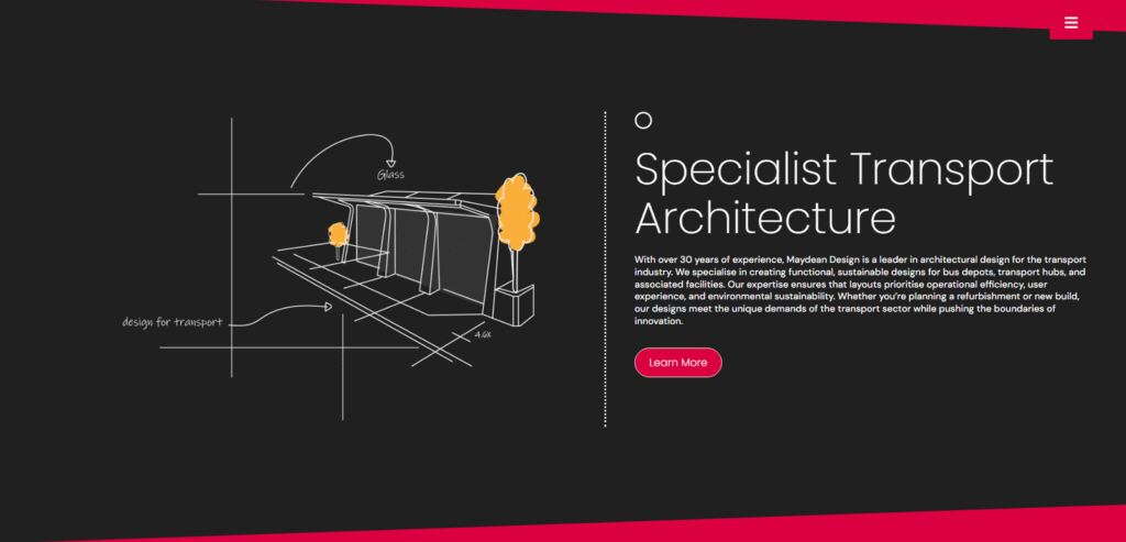
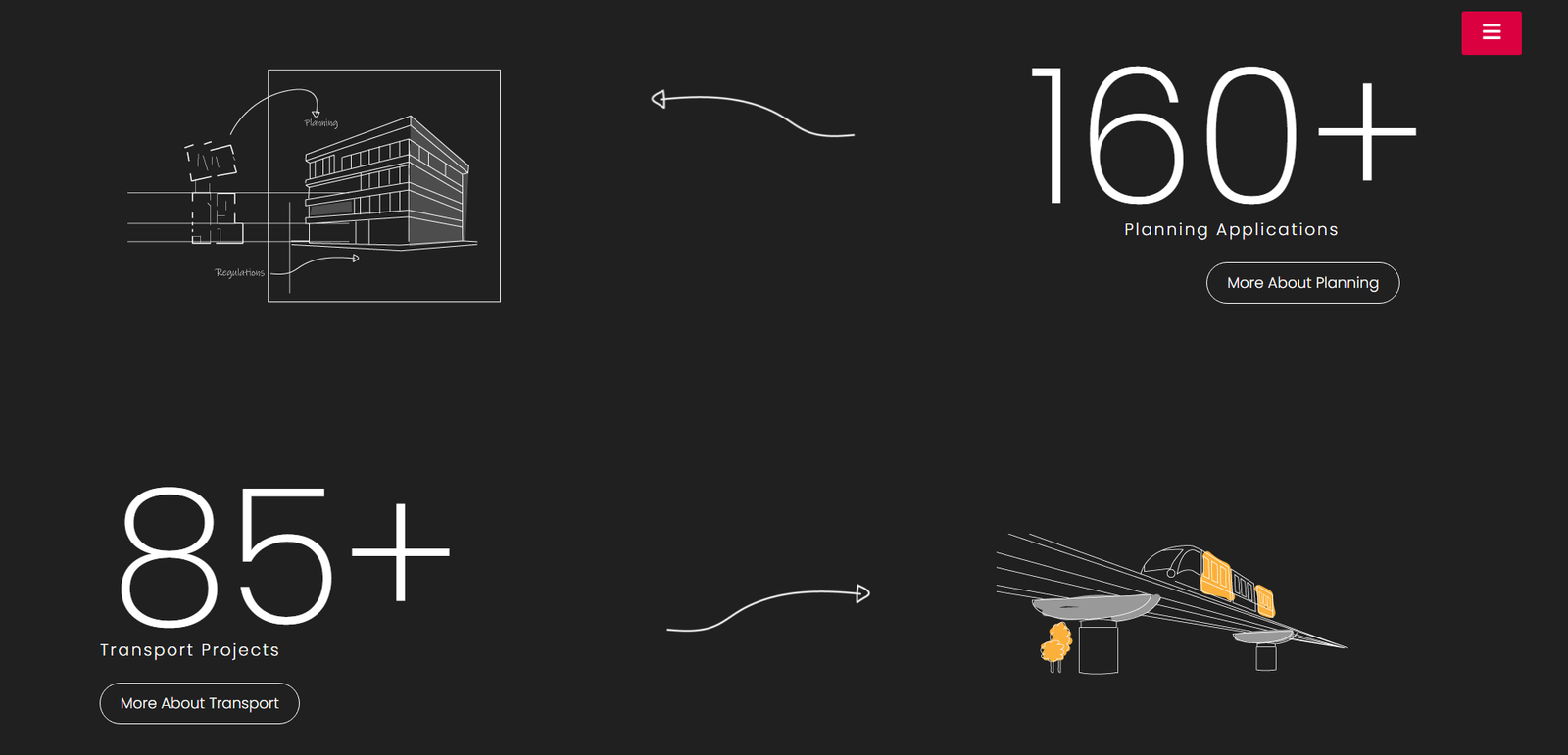
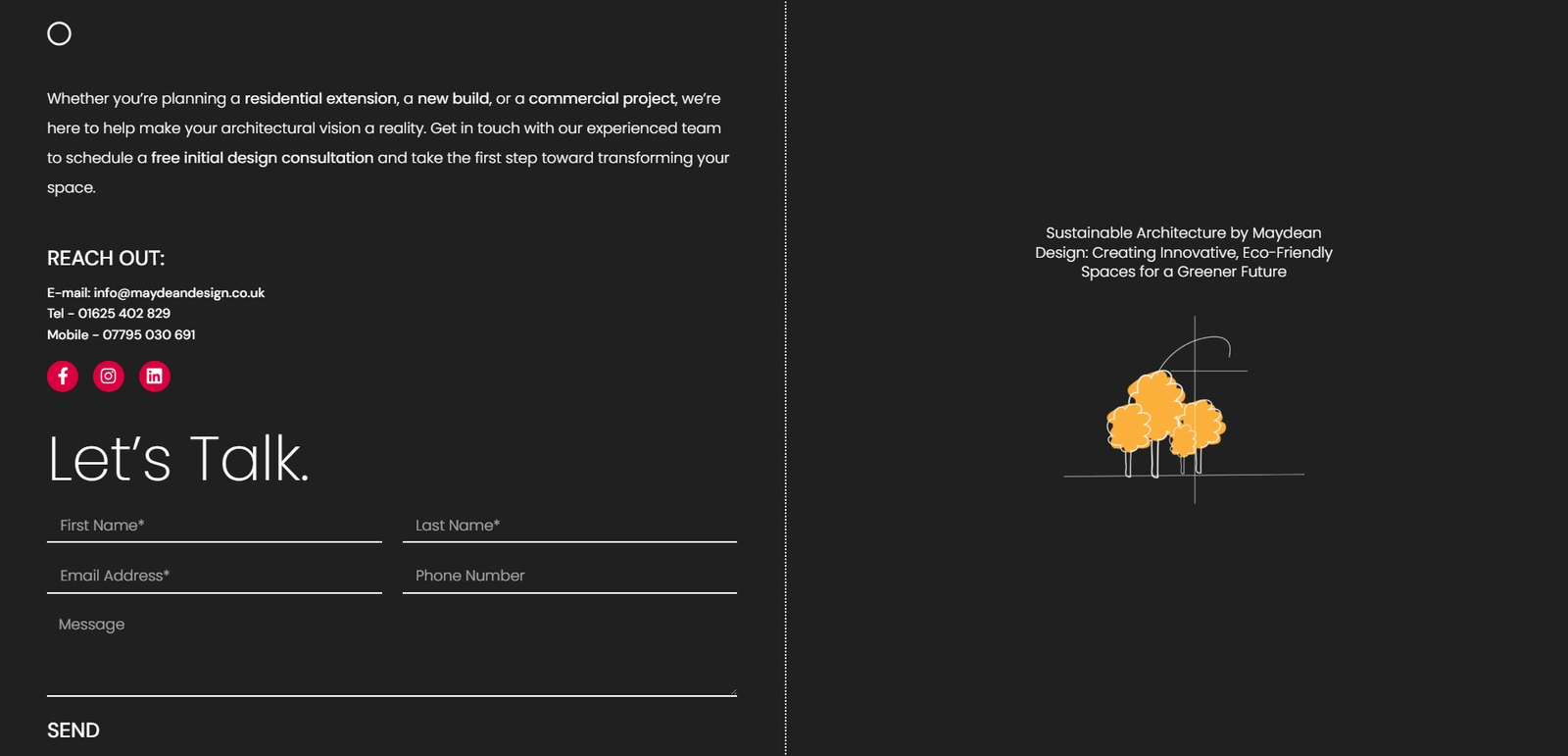
Maydean Design approached The Northern Bureau to develop a modern, minimal, and visually striking online presence — one that reflects the architectural philosophy behind their work. The site needed to highlight their portfolio, communicate their design ethos, and deliver a seamless experience across every device.
The Approach:
Architecture is about clean lines, considered space, and getting the details right. The website had to say the same thing without saying it out loud. Strong imagery was put front and centre, navigation stripped back to what mattered, and every section structured to guide the visitor from curiosity to confidence. The visual identity — logo included — was built to sit comfortably alongside the work without competing with it.
The Work:
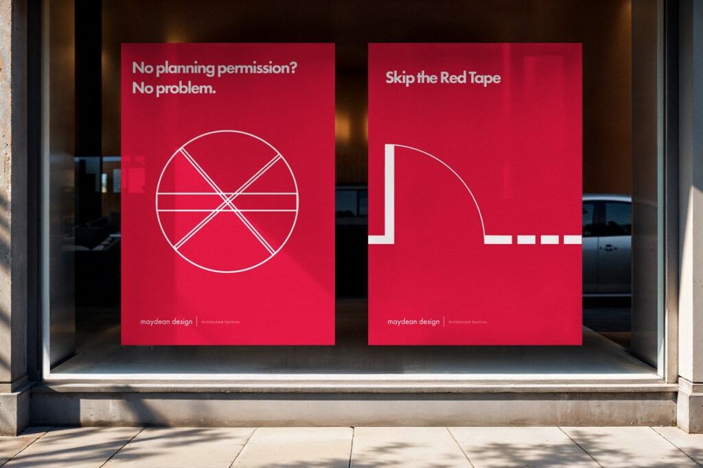
Logo and brand identity. Website design and build. Digital advertising. Three things that needed to feel like one considered whole rather than separate deliverables bolted together.
Client:
Nuked From Orbit – Apparel
Service:
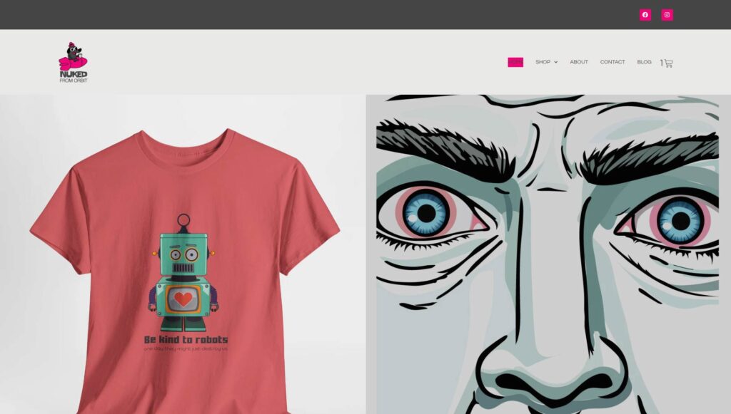
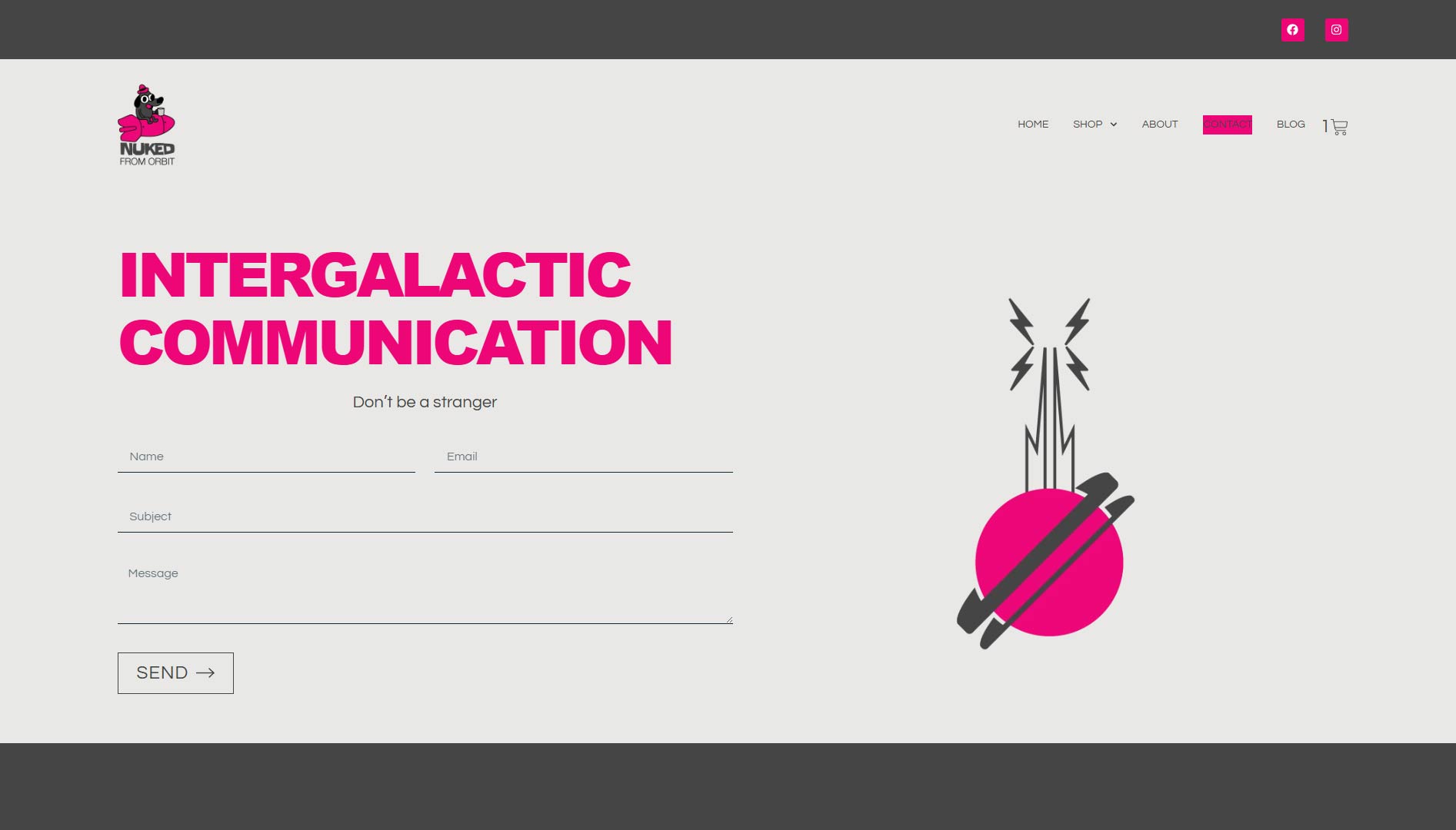
Nuked From Orbit design and sell bold, graphic print apparel for people who like their clothing with a point of view. From pop-art portraits to slogan tees, every piece is built around strong illustration and a refusal to blend in.
Brief:
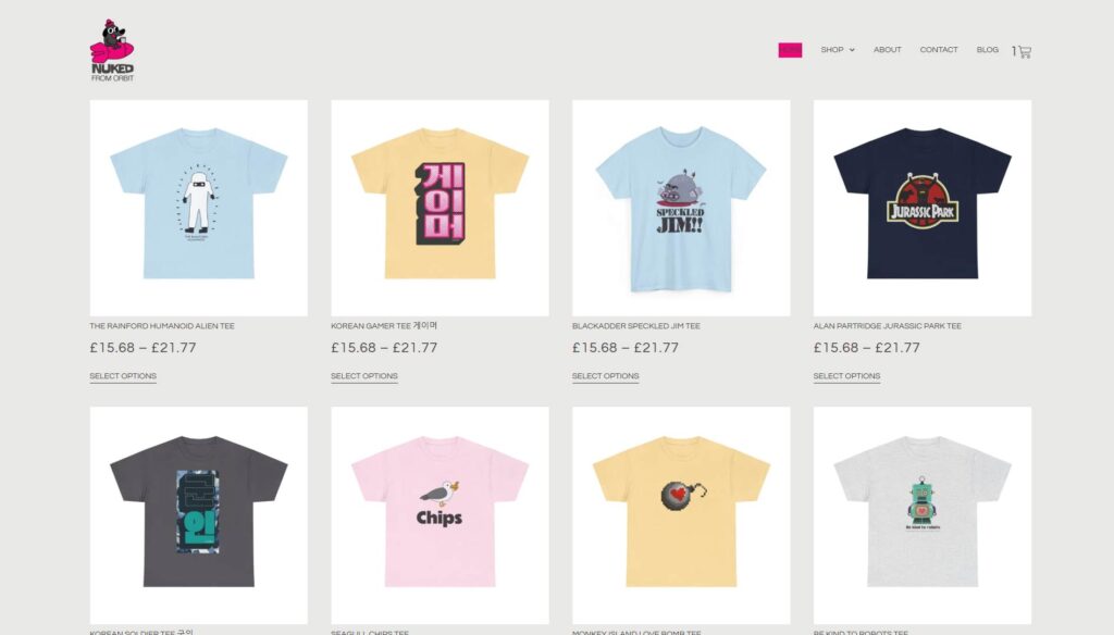
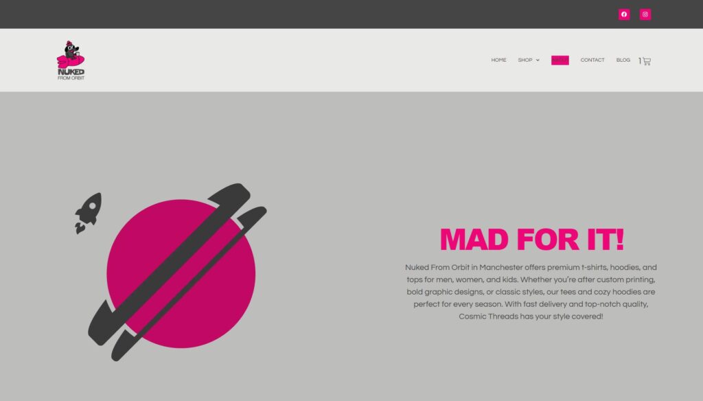
Nuked From Orbit approached Northern Bureau to build a bold, irreverent online store that matched the energy of their graphic print apparel. The site needed to showcase their designs with impact, make buying effortless, and feel every bit as characterful as the brand itself.
The Approach:
Great graphic work deserves a stage, not a distraction. The site was built to let the product lead — strong visuals front and centre, navigation stripped back, and every section designed to move a browser from interest to checkout without friction. The tone of the brand, sharp, playful, and a little unhinged, was woven into every decision, from layout to copy.
The Work:
Website design and build. eCommerce setup and optimisation. SEO foundations and on-page copy. Three things that needed to feel like one considered whole rather than separate deliverables bolted together.